The Power of Data Visualization in Decision Making
In an era dominated by data, effective data visualization has become one of the most important tools for decision-makers, analysts, and researchers. The ability to communicate complex information clearly and efficiently enables businesses to make strategic decisions faster and with greater confidence. At StatsMJ, we specialize in helping individuals and organizations turn raw data into actionable insights through visualization, analytics, and storytelling.
Why Data Visualization Matters
Humans are visual creatures. Studies show that 90% of the information transmitted to the brain is visual, and visuals are processed up to 60,000 times faster than text. This means that presenting data through charts, graphs, and dashboards allows decision-makers to spot trends and patterns immediately. A well-crafted visualization transforms data from static tables into meaningful narratives that guide strategic thinking.
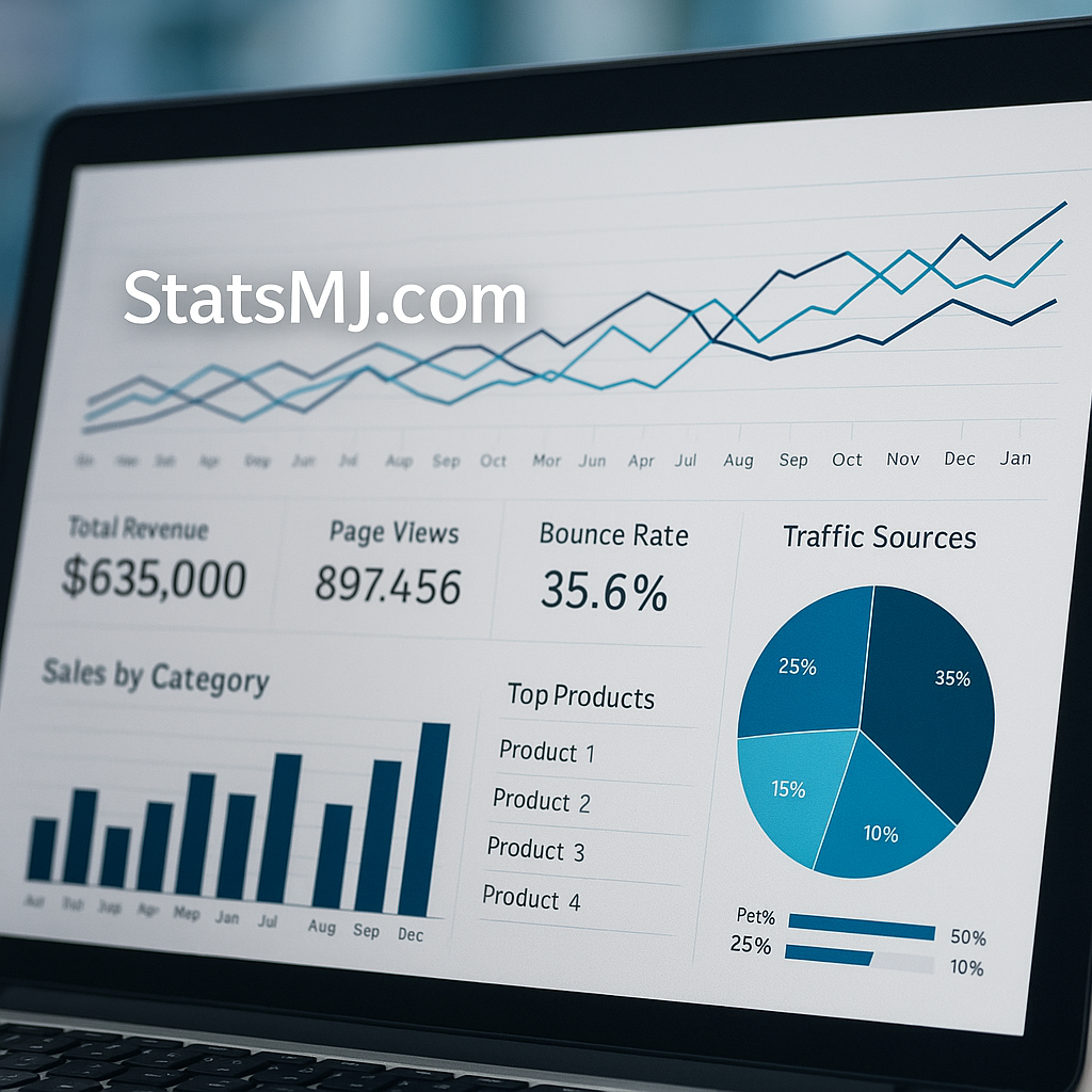
For example, a Power BI dashboard showing monthly sales trends can help a business instantly identify which regions are underperforming, which products are trending, and how seasonal changes affect revenue. Similarly, Tableau visualizations help organizations explore relationships between different metrics, leading to more accurate forecasts and informed business decisions.
From Data to Insights: The Visualization Process
The process of transforming raw data into insights begins with identifying the goal of analysis. Visualization should always serve a question or purpose — for instance, “What factors drive customer retention?” or “How is our marketing ROI performing over time?” Once the objective is clear, analysts can structure the data, select appropriate visualization tools, and design visuals that answer those questions.
Tools such as Python (Matplotlib, Seaborn), R (ggplot2), and Power BI have made it easier than ever to create interactive and dynamic reports. These tools enable analysts to connect directly to live data sources, automate updates, and share dashboards in real time across teams.
Best Practices in Data Visualization
- Keep it simple: Avoid clutter. Every visual should have a clear purpose.
- Use appropriate chart types: Line charts for trends, bar charts for comparisons, and scatter plots for correlations.
- Color with intention: Use consistent and accessible color palettes to highlight key insights.
- Provide context: Include titles, labels, and annotations so the viewer understands the story behind the data.
Poor visualization design can mislead decision-makers. Using too many colors, complex 3D charts, or missing context can obscure the message and result in incorrect conclusions. Therefore, clarity and precision must always guide visualization design.
Real-World Examples
In healthcare, visualization tools are used to track patient outcomes, infection rates, and hospital resource allocation. In finance, they help identify fraudulent transactions or visualize investment portfolio performance. Governments use visual dashboards to communicate public health statistics or climate data to citizens, making information more transparent and actionable.
During the COVID-19 pandemic, interactive dashboards from organizations like Johns Hopkins University became essential for tracking global infection trends — a prime example of how visualization can help the public and policymakers alike make informed decisions.
The Future of Data Visualization
As artificial intelligence (AI) and machine learning (ML) continue to advance, visualization will become even more intelligent. Automated dashboards will not only display data but also generate predictive insights, alerting users to anomalies or potential risks before they occur. The integration of natural language processing (NLP) will make it possible to ask questions like “Show me sales growth by region” and instantly receive dynamic, visual answers.
The future belongs to organizations that can combine human creativity with machine intelligence — where analysts and decision-makers collaborate through data storytelling. At StatsMJ, we help students and professionals build these exact skills through guided projects and analytics mentorship.
Conclusion
Data visualization is more than just pretty charts — it’s the language of modern decision-making. It turns raw numbers into understanding and uncertainty into action. By embracing visualization tools and best practices, organizations can make smarter, faster, and more confident decisions. Whether you’re a student learning statistics or a business leader managing operations, mastering visualization is a key step toward data-driven excellence.
Leave a Comment